
Layout sketches, content planning, and functional ideation.

Initial moodboard for styling ideation.
This begins to to set the tone for colors, fonts, photography, and some beginning ideas for animation.

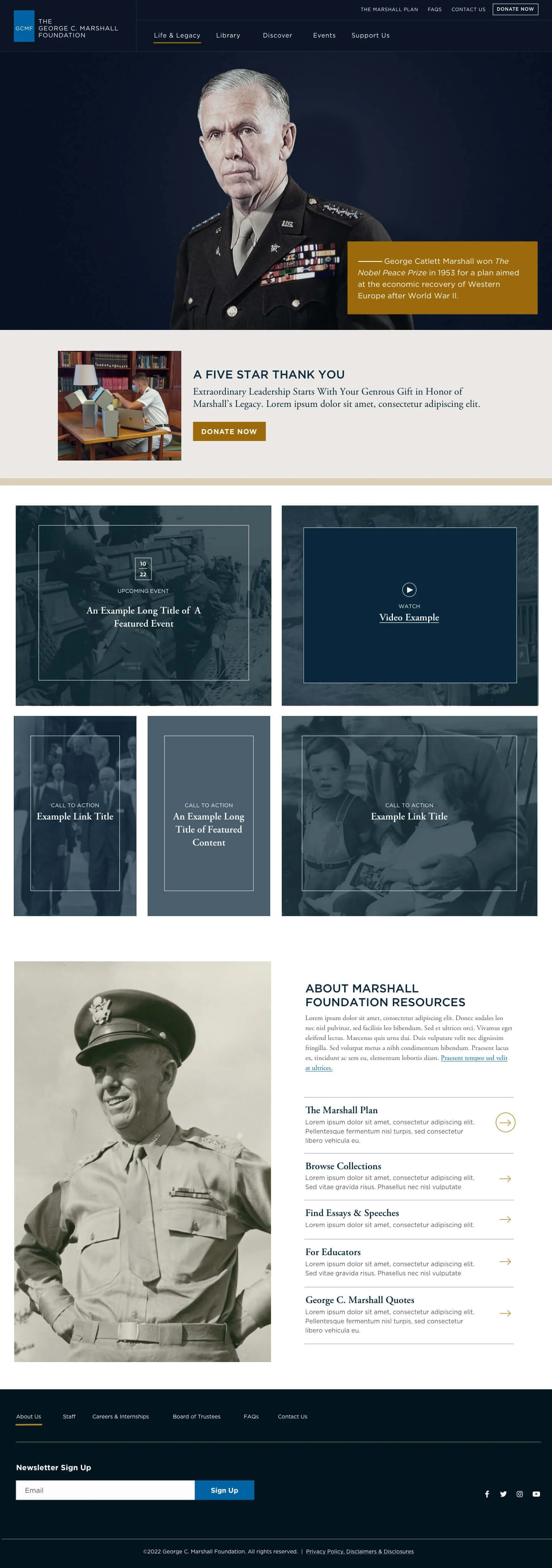
Home Page Design
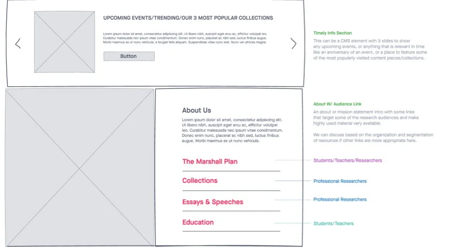
Pulling together the IA, sketches, wireframes, and the collected user data; we started to nail down clear organization of the library resources. Here the style is honoring the history in a strong, sophisticated way.
Example Inner Page + Sub Navigation Expanded
Carrying through the styling and clear organization to the sub navigation was essential for allowing users to find resources with ease.

Original Website
Below is a screen capture of the original website.

George C. Marshall Foundation
The information architecture was updated based on the clients new needs for the library, the user feedback, and the available user analytics. The top goals for the new site were clearer organization of resources with easy entry points for the most searched for and visited pages. We knew that our audience for this was primarily academic researchers from middle school to college, so a large part of our focus was to organize the data and resources in a clear and engaging way. One of the main goals from the client was increasing photos and making the international presence of Marshall more obviously. A large segment of the users are outside of the United States, so we didn’t want the site to feel too patriotic. Our goal visually was to marry the international history of Marshall with the increasing digital presence of the library. For this our goal is to bring the old historic photos to life with simple zooms and pan animations on scroll to breathe a sense of life into this beautiful piece of history.
Visit Website